
Overview
Accessible links (also known as hyperlinks) connect concise and descriptive text to a website or file. They make it easier for everyone to navigate and consume content.
PowerPoint Templates
Take the guesswork out of whether your titles are accessible or not. Use the templates below that are already digitally accessible.
Download the General PowerPoint Template
Download this accessible PowerPoint template. Please use the built-in Link styles to create consistent and digitally accessible materials. Follow the best practices shown in the video below.
Download the Teaching PowerPoint Templates
If you are teaching at the College of Medicine, please download this accessible PowerPoint template that is specifically set up for teaching presentations. Please use the built-in Link styles to create consistent and digitally accessible materials. Follow the best practices shown in the video below.
The video shows how to create accessible links in PowerPoint, Word, and Outlook.
Use Links in PowerPoint
Clear and descriptive link text improves digital content for:
- Individuals using screen readers.
- Those who are neurodivergent.
- People with mobility challenges.
- Voice-control-software users.
About the Linked Text
When choosing linked text, keep accessibility in mind. Linked text that is optimized for accessibility is:
- Descriptive.
- Concise.
- Unique.
- Visually distinct.
Link text should clearly communicate the purpose of the link. Screen-reader users can navigate through a list of links, so the text must make sense when read on its own.
Unclear description
When directing a reader to Appendix 1 and using the words Click here, it is unclear where the reader is being taken.
A better option
Instead, use meaningful text, Read Appendix 1, which clearly states where the reader is being taken.
Link text should be brief and meaningful. Long link phrases can be hard to read visually and challenging to understand when announced by screen readers. In most cases, a few well-chosen words are sufficient.
Example: Read Appendix 2
Two or more links with the same text can introduce confusion, especially if they link to different resources.
Another reason why linking the words Click here or Learn more that go to different websites or documents is not accessible.
If you are linking to the same source, it is best to use the same linking language.
Linked text must be easy for sighted users to identify. By default, the PowerPoint templates displays links in blue with an underline, which provides strong contrast against standard black text on a white background.
Use the PowerPoint templates to take the guesswork out of making your links visually distinct.
Add a Link in PowerPoint
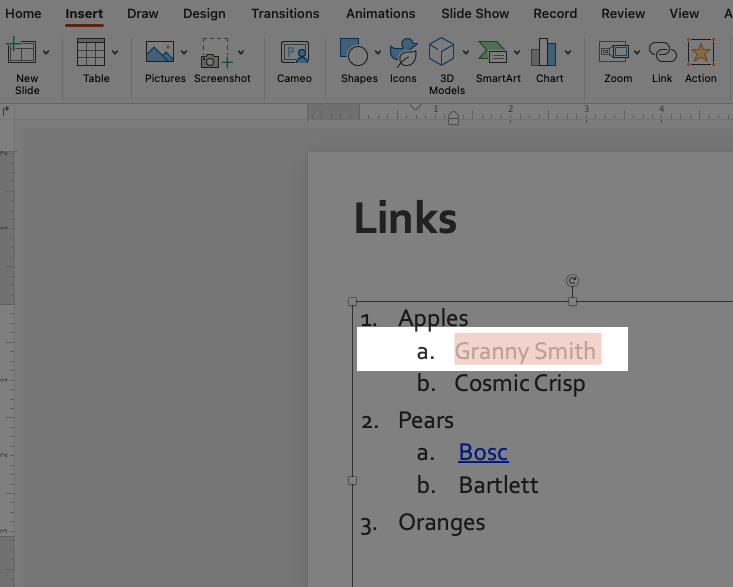
- Highlight the text that will become the link. Your screen may look slightly different, but highlighting the text is the same for Windows or Mac computers.
- Add the link. Instructions are different for Windows and Mac computers.
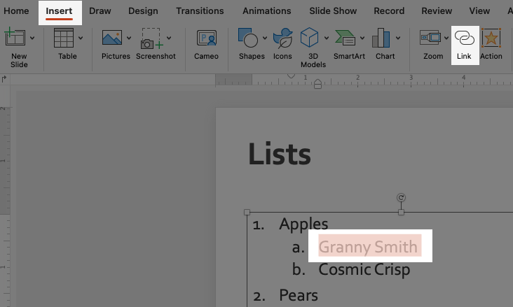
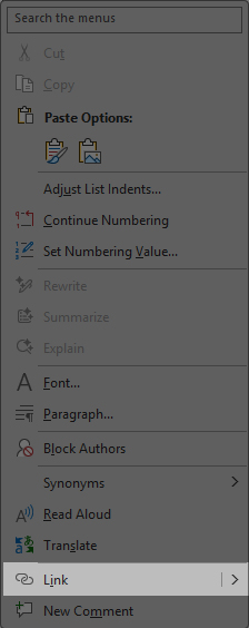
There are two ways to add a link:
- Right-click or Control + Click and choose Hyperlink.
- Or, go to the Insert tab and then tap on the Link tab.
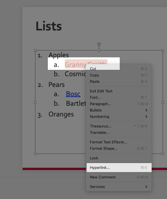
Right-click or control-click to get the Popup menu. From the popup menu, select Link.
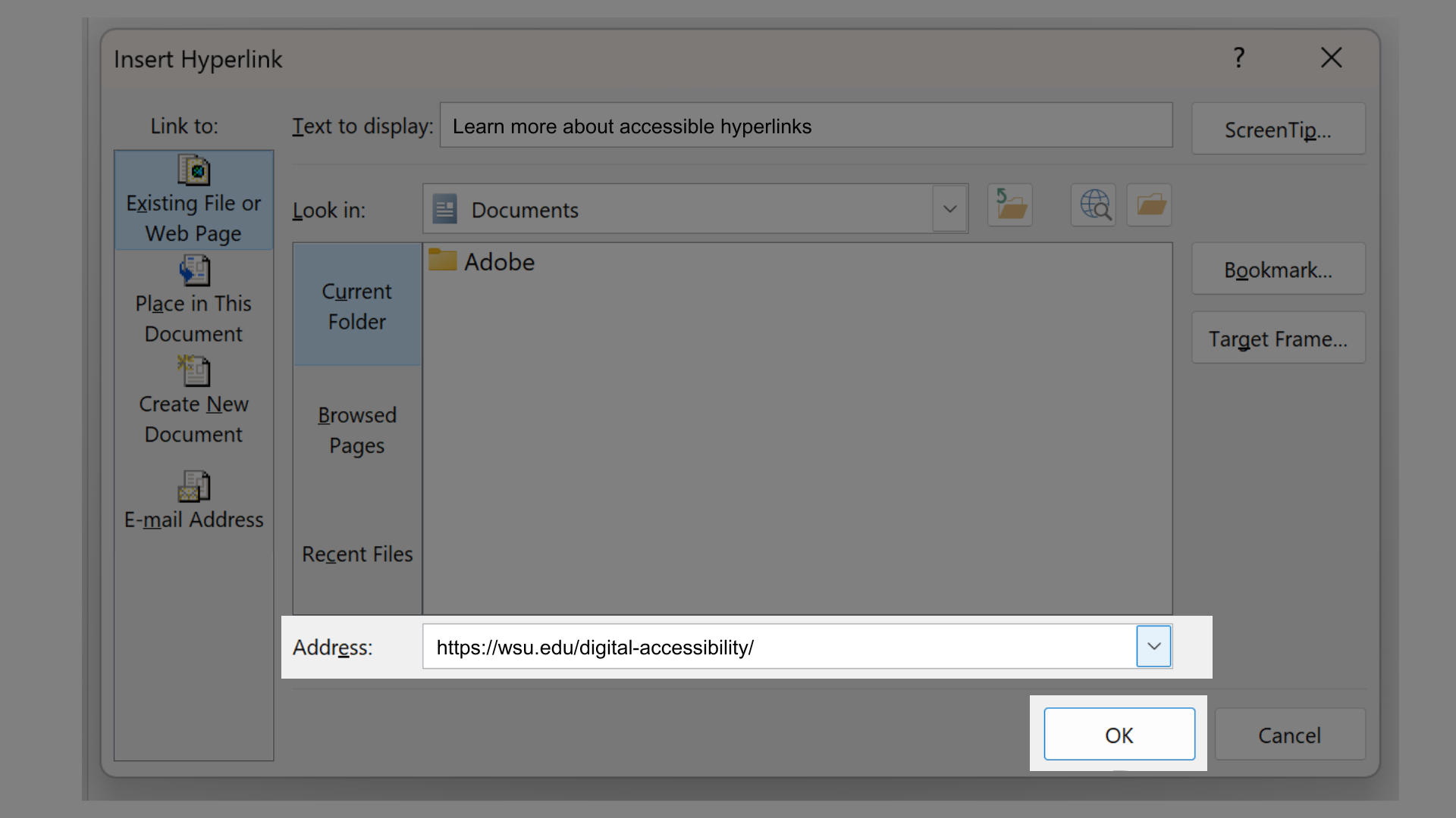
- Add the URL destination. The window is slightly different on Mac and Windows computers.
Depending on your destination, choose Web Page or File, This Document, or Email Address. Add the URL destination, and click OK.
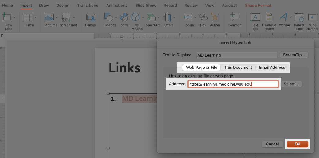
Add the URL destination and click OK.
Best Practices
- Use the PowerPoint template with accessibility built in.
- Use clear and concise language for link text—no more than a few words.
- Use unique and meaningful link text that describes the link destination and can be understood out of context.
- Use the same link text when linking to the same destination.
- When links go to files or other digital formats, include the digital format in the link. Example (not an actual link): Core Concept Check Sheet (PPT)
- Do not use a URL (https:// web address) as the link text.
- Do not underline text in a PowerPoint presentation. Underlining should be reserved for links.
- Do not use vague language in your links. Example: Click here or Learn more.
FAQ
Accessible hyperlinks ensure that people using screen readers, keyboard navigation, or voice control can understand where a link goes and decide whether to activate it.
Everyone! But especially:
- Users of screen readers.
- Users with cognitive disabilities.
- Anyone scanning content quickly.
Screen reader users may hear Click here or the entire URL with no context, making content confusing and unusable.
No. Screen readers often list links out of context, so Click here provides no meaningful information.
Yes. Multiple links with the same text but different destinations are confusing for assistive technology users.
However, if you have several links that go to the same destination, use the same link text.
Screen readers navigate directly from link to link and may present links as a list, separate from surrounding text.
No. Sometimes screen readers read links out of context without the nearby explanatory text.
Yes. Keyboard users often tab through links, so clear, descriptive link text is essential.
Microsoft PowerPoint creates functional links, but it does not ensure the link text itself is accessible, which is up to the author.
Sometimes. It may flag Click here or raw URLs, but it does not catch every accessibility issue. It is up to each of us to thoroughly check our documents.
Yes, as long as each link is clearly described and distinct.
If there is more than one link in a sentence, you may want to consider adding a bulleted list with links instead.
Using vague link text like Here, More, or Download.
Be descriptive, clear, and concise with your link text.
Resources
- WSU Core Competencies: Links.
- WSU Links and Accessibility.
- Accessible PowerPoints (Video).
- How to use the PowerPoint Accessibility checker.
- Create Accessible Presentations (Video).
- Microsoft: Make your PowerPoint Presentations Accessible to People with Disabilities (Written).
Need assistance?
Contact the College of Medicine Digital Accessibility Team if you have questions or need one-on-one support or additional training.
Contact the Digital Accessibility Team