
MacOS
Windows 11
Windows 10
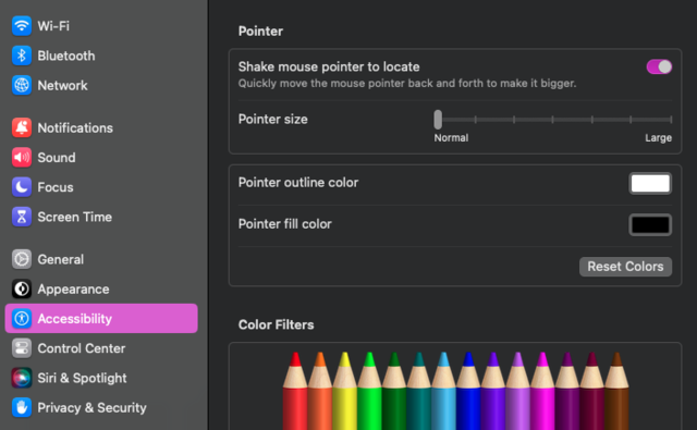
MacOS
- Open the Apple menu > System Settings. Then click Accessibility in the sidebar and then Display on the right.
- Go to the Pointer section to increase the pointer size to the size you’d like.
- Additionally, change the pointer outline color and fill color separately.
Instructions for older MacOS can be found here.
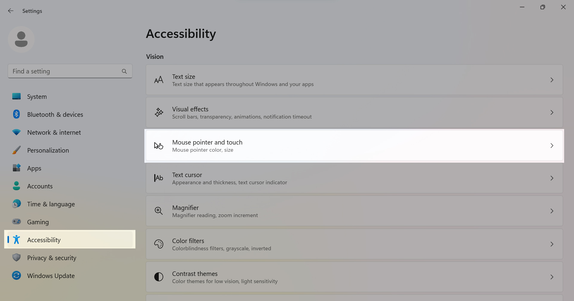
Windows 11
-
- Go to the Accessibility settings on your computer by selecting the Start button > Settings > Accessibility.
- Select Mouse pointer and touch.
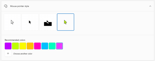
- Under Mouse pointer, adjust the Size slider to the size you’d like.
- Under Mouse pointer style, select an option to change the color of your mouse pointer.
Additional information to make your mouse, keyboard, and other input devices easier to use can be found here.
Windows 10
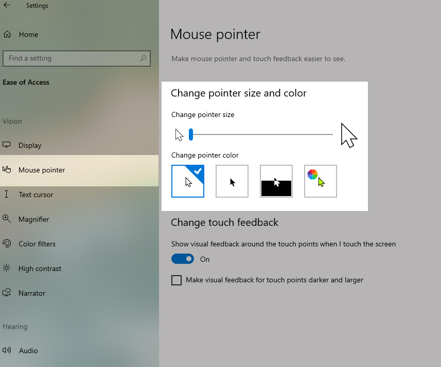
- Select the Start button, then select Settings > Ease of Access > Mouse pointer.
- Adjust the slider under Change pointer size until your mouse pointer is the size you want.
- Additionally, select an option to change the color of your mouse pointer.
Additional information to make your mouse, keyboard, and other input devices easier to use can be found here.