This blog post is based on presentations that we gave at the AAMC Group on Information Resources in December 2022 and the Building Bridges conference in August 2022. Part 2 includes the details on how the website is set up and the tools that we used.
Why did we build a website?
Lots of backstory—stay with us, dear reader! The College of Medicine was founded in 2015, welcoming its first class of students in the fall of 2017. This meant that, in addition to hiring a college’s worth of staff and faculty, the curriculum for the college had to be built from the ground up, on a very short timeframe—just over a year.
An all-digital curriculum
Documentation was needed!
Accreditation
Our original lone instructional technology specialist (now the manager of our EdTech team), Jacki Hudec, had written 50+ pages of great documentation over the first three or four years of the College: tutorials for E.Flo MD and all of the technology offered by our department. They were created in Articulate Rise, which is a course-authoring tool, and that did the job well enough.
After four years, we were ready for more dynamic navigation.
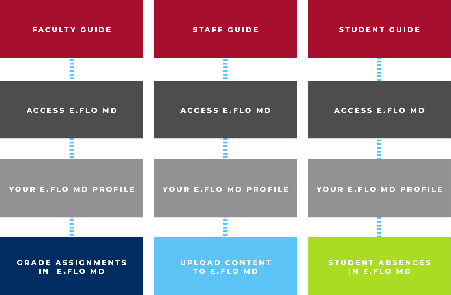
Articulate is ideal for linear navigation, so tailoring our materials specifically for our faculty, students, and staff required duplicating information.
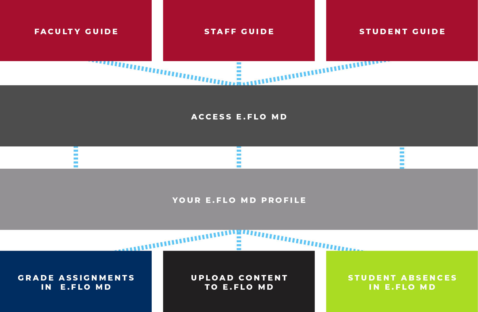
Before and after: Linear navigation to complex web navigation


The process was both inefficient and prone to error. Maintaining the materials in multiple modules for the different audiences was extremely inefficient and yet another thing to keep track of. (For example, we want to have information about E.Flo MD in materials for all of our readers. For it to be in individual guides for students, faculty, and staff, it meant duplicating the information in all three guides. So when our instructions were ready to be updated, it had to be done three times.)
We needed a complex, efficient web, where we could have one set of information that could apply to multiple pathways.
In addition, the college is forever growing and hiring new faculty and staff—we have 1,200 clinical faculty alone!—so onboarding new members is always happening. Institutional knowledge in a new college, where decisions are not necessarily being written down, can’t just live in someone’s head (right?).
Finally, Articulate URLs are auto-generated and impossible to remember—wouldn’t a nice, friendly domain name be ideal?
Our timeframe
February–March 2020: First thoughts
The thought that we needed something more dynamic was sparked in February–March 2020, and the start of the pandemic in March 2020 only amplified that idea.
Mid-March 2020: We all know what happened
Danielle Conti, our front-end web developer, started in mid-March 2020 (her first day in the office was also the last one for many months, as it was the day we realized we needed to go remote for the foreseeable future).
There was suddenly a high demand for documentation—How to use Zoom? How to teach remotely?—and distribution of it turned into a mélange of Word documents and PDFs, mostly by email. It was hard to keep track of and inefficient for both the publisher and the reader when the information needed to be updated, as technologies changed rapidly with the move to remote work.
The advent of the pandemic only drove home what we already knew: We needed a real website.
June 2021: Page building started
We started using Elementor in June 2021 and began building templates and designing the main pages. The content migration from Rise also began.
January 2022: The site went live
We soft launched the website in January 2022, sharing links when someone needed documentation or instructions.
March 2022: We hired a web coordinator
We hired Heather Jansen, our web coordinator, and she took over the production of the stream of tutorial pages that hadn't been added to the site.
June 2022: We course-corrected
We had to take a hard look at the categorization of all of our content and shift a bit—the Keep Learning and Related Reading sections at the foot of our tutorials weren't quite hitting the mark, and we realized that our categories were a little too broad. They had worked well with the first batch of ~75 pages that we created, but as the site bulked up and a wider range of content came in, we deleted some categories and added several more. The result: the most applicable content following our tutorials.
August 2022: Links were sent to incoming students
We started advertising the site to students, faculty, and staff at the beginning of academic year 2022. It was an integral part of getting our new students ready to start school in the fall—an example is the introduction letter from Erika Fleck, our director. It was the first of our communications with the students and relayed vital information that they needed to know before school started in August.
One of our booths at the C.O.M. Halloween fair publicized the site, as well as the Medicine Digital Learning website.
The site is used every day by all three of our categories of readers (students, faculty, and staff). As of December, we had had over 1400 unique sessions in the past 30 days. Faculty and staff come to the site for a wide range of topics: how to use a digital whiteboard, what the new Zoom updates are, information about our new teaching studio, etc.
New features and functionality that have been added to our custom LMS are announced via the blog, with documentation pages updated accordingly.
We continue to refine and improve our materials—one example is the addition of a two-click feedback form at the end of our tutorial pages—while ensuring that the website as a whole (nearly 300 pages and blog posts) looks and functions perfectly consistently.
How did we do it?
Read Part 2 for all of the details!


 by the Office of Technology